Quantcast
Channel: Studio Incamminati Blog
Viewing all 103 articles
Browse latest View live

Color Study at Studio Incamminati

$
0
0


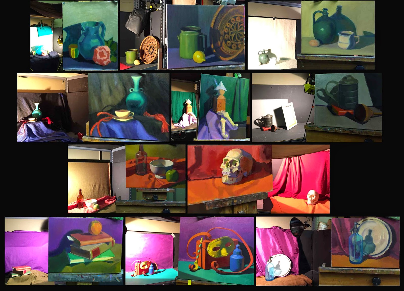
COLOR STUDY - LEVEL ONE

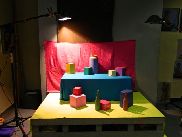
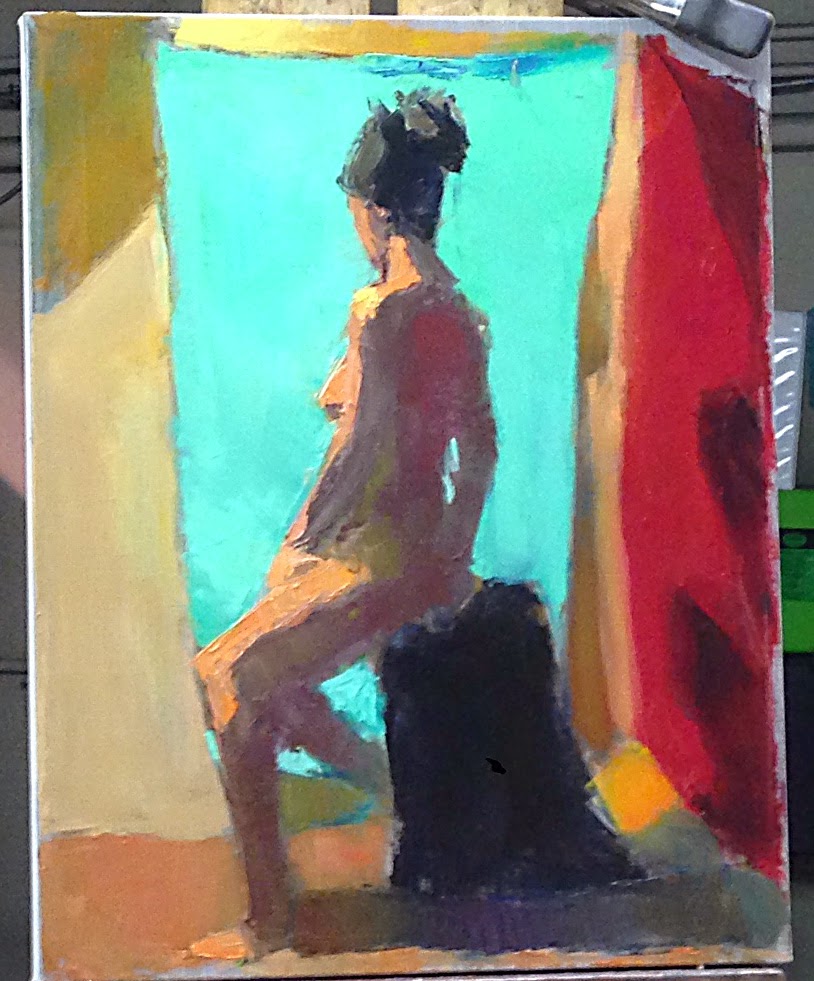
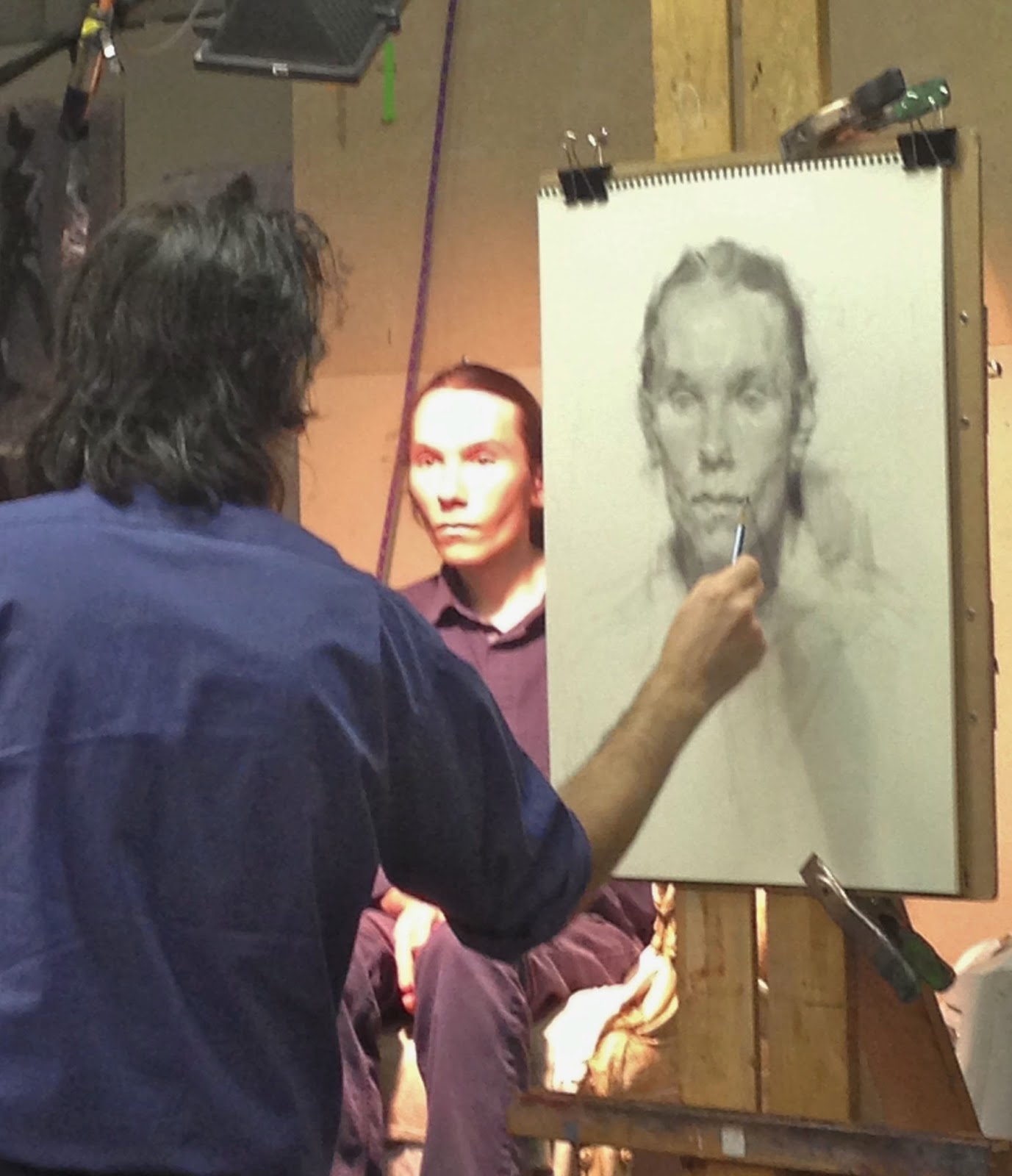
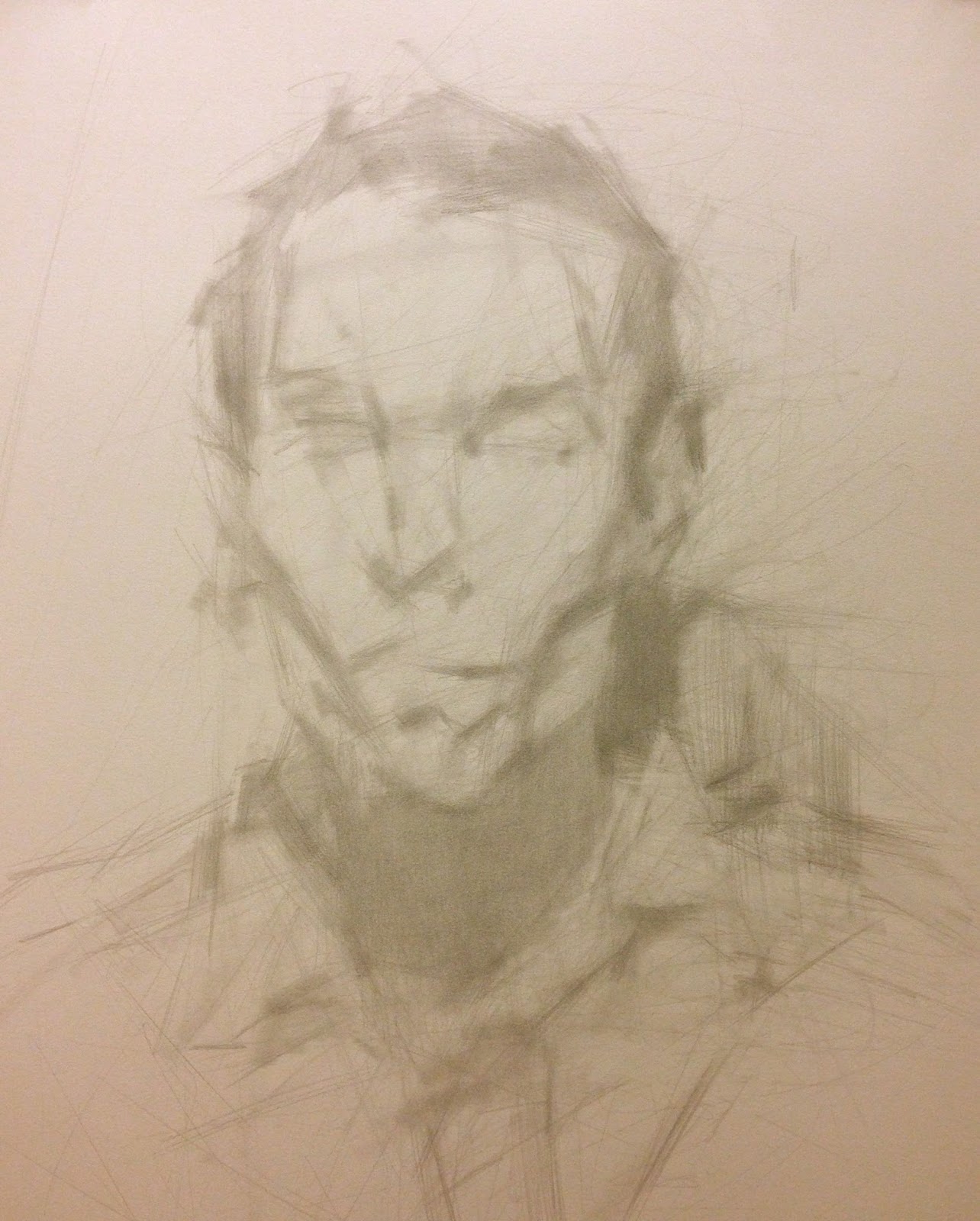
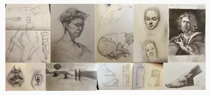
Remember that moment in the film "The Wizard of Oz" when Dorothy steps out of her black-and-white world by opening her front door and gazes into the razzle-dazzle color world of Oz?  Well, that is what it will be like when you take your first year at Studio Incamminati and, after nine months of charcoal gesture drawings and value studies, you embrace a palette of 23 colors and look out onto a stage of painted boxes.

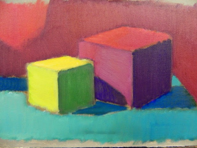
We are told that, rather than match the color you see, you must push the relationships of color to give the full effect of the light on form. This is the same concept with value study. It is not about matching the value you see, but experiencing that value in the context of a light situation.

Our course description, below, will clarify the objectives.
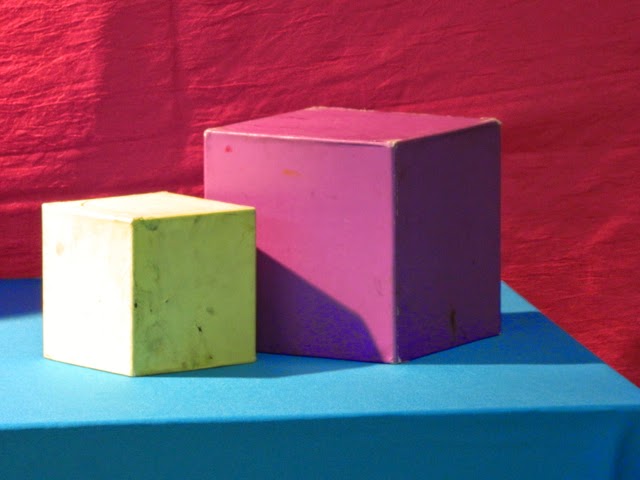
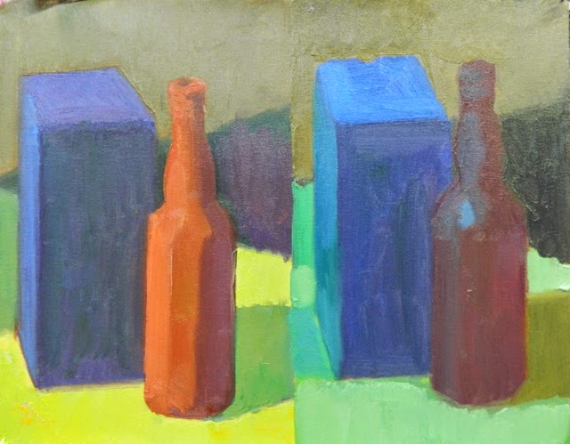
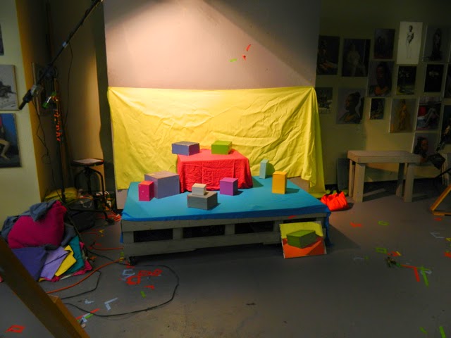

Start with one box.


Push the realm of color as value.


Course Description

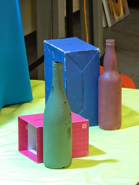
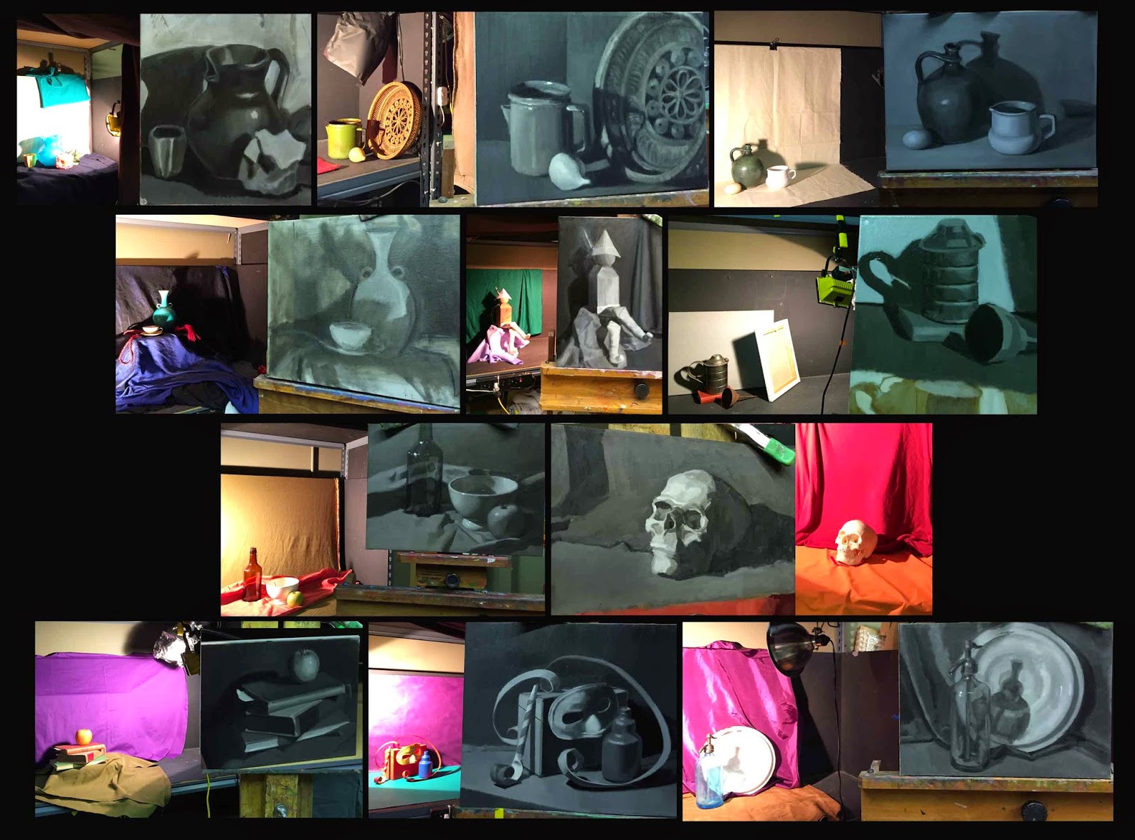
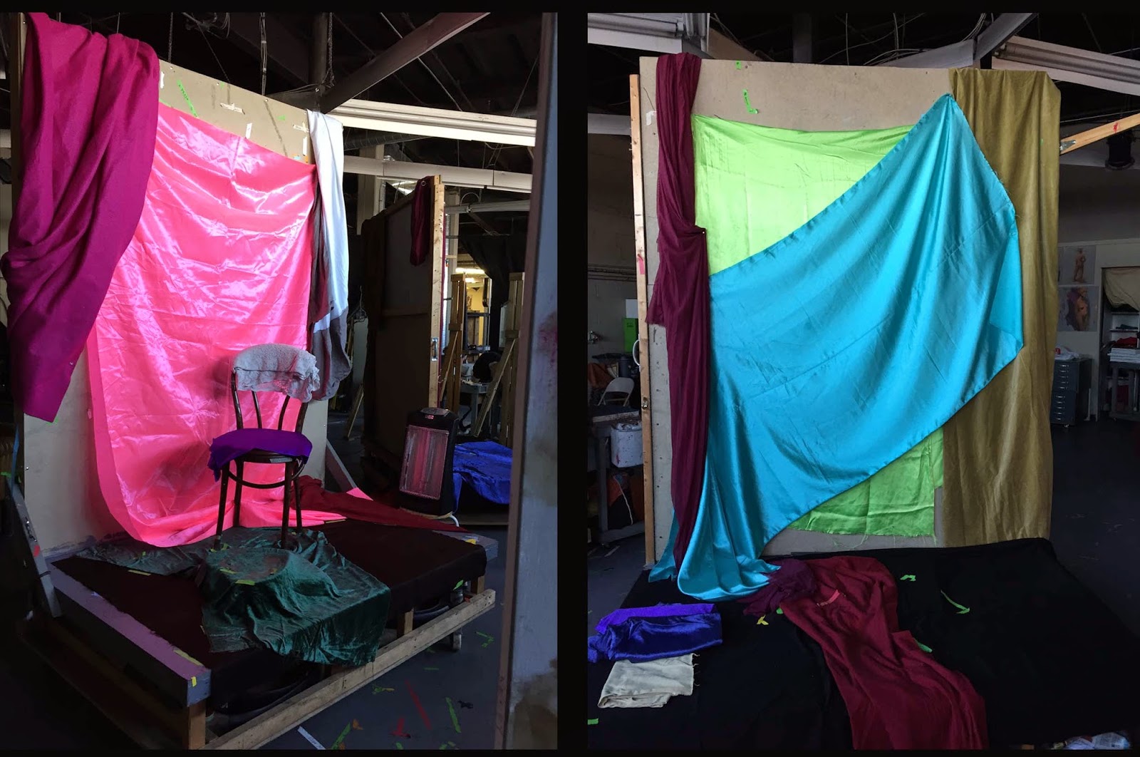
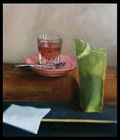
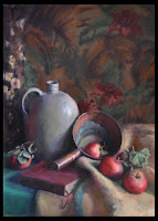
The purpose of this class is to gain an understanding of color relationships and pigments, and to gain the ability to recreate the illusion of light on form through a series of simple exercises called color studies.  For this semester, these introductory color study exercises will involve painting colored boxes and simple still life objects under artificial light.   
Emphasis is placed on understanding the various elements, i.e. value, hue and saturation, that influence color relationships.

Outline
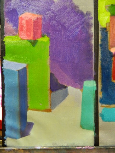
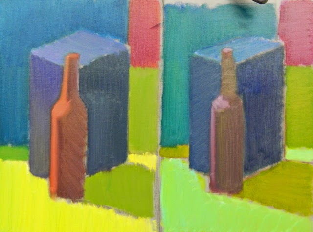
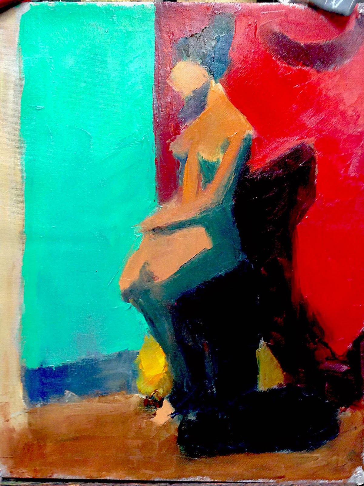
Students begin each color study by establishing simple light and shadow masses in grisaille. They will then build the painting with simple shapes of color that capture and recreate the relationships of the lighting situation. The semester will begin with simple exercises utilizing boxes or objects that have planes and strong color, and will increase with complexity as the semester progresses and as the student demonstrates readiness. 


We have been told that we will do at least one hundred of these.


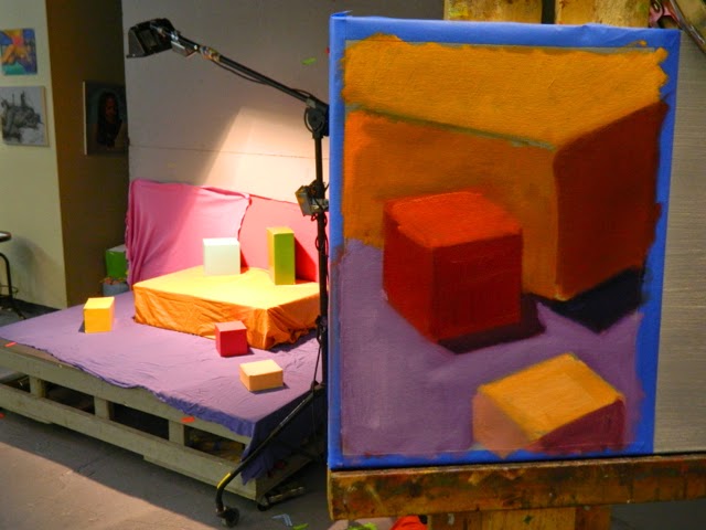
There are three passes. The first time around you will be getting your first impression of the relative value, reaching for the boldest statement of color and the least amount of mixing.  In fact, mix on your canvas.


The second pass would be an alteration of the values to more approximate the situation.


The third pass would be a hue and temperature decision and another calibrating of the values.

For reading on the matter, a book on 


Color Study At Studio Incamminati, Week Four

$
0
0
As we work on these color studies week after week, we get the hang of it. Fun to do because there is no concern, really, for the drawing of the boxes. It does not matter if the proportions are off. This is about seeing large color and value relationships and learning which colors to mix together to get an approximation of what we are seeing. Remember, when you are doing your color study you are not trying to match the color you see, but rather, recreate the illusion of the quality of light and color relationships.

In order to set up your own color study still life, you will need many painted boxes of all sizes, pretty colored drapes, a good light source (we use halogen Home Depot lamps) and a dark room to work in. You could also set it up outside and do it in the sunlight, like Henri Hensche did. To start, however, perhaps artificial light will be easier because it will not change over the course of three or six hours.

It gets really exciting (to us, anyway) when the boxes in light and shadow start creating a sense of space and atmosphere, an illusion of depth, as it were, and yet all we were trying to do is see the color relationships accurately. What is behind? What is below? What is above? What is beside?


After three hours of working from these halogen light sources, our instructors, Natalie Italiano and Joe Dolderer, place colored gels over the lamps. This changes the color and the light drastically, as you can imagine. The following pictures have two studies on them, one in halogen light and the other in the effect of the bluish greenish gel.


It is important to start with the brightest color you see when you are making your first pass into your color study. It is much easier to dull a color already up there than make it, and all the surrounding colors, brighter. So start bold and brash and end up very lyrical and poetic. See how you can develop this very new art form.

In my name, Michela Mansuino


A day in the life . . .

$
0
0
... of a Level Two student.

Ever wonder what it's like being in the full-time professional program at Studio Incamminati? I'm Wendy Wagner and I am a Level Two student in the program. Welcome to my Monday:

7:45 a.m. Arrive at school. The cold, rainy, gray day outside is a contrast to what awaits me inside: color study with the figure.


8:45 Enter studio B for color study. The first nine weeks was color study with still life and the rest of the semester is with the figure. Class starts promptly at 9; our instructor is Jafang Lu, and she's fab. Before enrolling as a full time student, I took JaFang's Continuing Ed classes on Fridays and learned a lot.

9:00 This is our second week with the figure. JaFang reduced our 21 color palette down to 12. To further make us simplify, we have to use a palette knife. Keep that in mind while viewing our progress throughout the day. Since I like to look at the other students' progress as I go, I thought you might too.

Pose 1: Grisaille. Light and dark shadow shapes for both the figure and the environment. We were permitted to use a brush for this stage only.
Pose 2: Adding color notes for the light, then the dark areas.


Pose 3: Once all color notes have been added, we expand the notes to cover the areas.

JaFang has been having a random student "demo" in front of the class, asking questions about the choices we have made. Students will also give input on the direction of a color.  Today was my turn.
Here is my painting before and after:


Noon: Break for lunch.  Everyone has lunch at the same time, so it's nice to chat with other levels. Upper level students are a good resource for advice as we all discuss our progress.

12:45 Class resumes. Once the canvas is covered in paint, we begin the second pass.


 Color is affected by what surrounds it, so the initial statement may not be accurate in relation to the other colors. It is important to not just stare into a color. Scanning our eyes around the canvas quickly gives us a better impression on which direction to push it.


Sometimes you think it should go one way, so you add that color. Then it becomes apparent that you need to go in the other direction. You don't know until you put something up there.

By the end of the day, we should have at least two passes on each color, adjusting the color relationships as we go.

Between this and manipulating paint with the palette knife, it has proven to be a challenging day. Here are the results of our work:


3:45 Whew! The day is over. Next time you can shadow my Tuesday.


Back to Basics

$
0
0

   What is is essential for musicians to practice regularly? Answer: scales. They are the ABCs used to build words, sentences, paragraphs, stories. As level 1 students at Studio Incamminati, we have been introduced to the visual equivalent of musical scales through copious amounts of gesture drawing, thumbnail sketches, still-life block-ins and value studies, all in charcoal.

   Last week, I had the opportunity to talk with school co-founder Leona Shanks about another essential skill set akin to musical scales, namely drawing the sphere in space. In the front of almost every drawing book is an image of a sphere sitting on a surface with light shining on it. It is largely forgotten as other topics are dealt with. 


Planar Sphere


   So why is this idea so important? In any kind of realistic art, the artist must be able to control light as it falls on form.  With time and ample practice, the artist should start to be able to see how spheres, cones and cylinders appear in different parts of the figure AND understand how to show the effect of light on those forms accordingly. Leona recommended practicing drawing spheres for 30 minutes a day for at least 1 to 2 months to help make this skill become second nature to the artist. 

Leona Shanks' demo


Other tips from Leona:

It is important to develop a beveled tip on the charcoal and hatch in large areas smoothly. 


Charcoal with beveled tip


Edges should be organic, meaning no linear outlines (there are no lines in nature). When working with charcoal, this means working against the direction of the outline. 


Wiping across the form to create organic edges


In figure drawing, it is very important to make shapes clear. Leona recommended looking at the drawings of Prud’hon for good examples of this.


Don’t be deceived by what seems like an elementary concept. As Henry Yan has said, “Stick to the basics - any brilliant styles or fancy techniques come from skillfully controlled basics.”


On Proportion and using the Cranial Index

$
0
0
   Throughout history, there have been different canons of proportion for the human figure. Typically, this has involved using the human head as the basis of measurement. For example, Michelangelo’s ideal figure was eight heads high, while that of Dr. Paul Richer, the renowned 19th-century teacher of artistic anatomy, was 7.5 heads. The problem for the student, however, comes in the act of measurement. If you measure two or three or four heads down from the top of the head, what do you intersect with? There may be something convenient, such as a navel, or they may be nothing significant at all to help anchor your measurement. Fortunately, there is another approach championed by Robert Beverly Hale, which alleviates the previous problems by focusing on that which underlies everything in the human body - the skeleton. This approach relies on the cranial index unit instead of the head as the basis of measurement for human proportion.

   So, what then is the cranial index? As seen in the diagram below, the cranial index is the unit formed from the base of the skull (mastoid process) to the top of the skull. This unit becomes a box which can then be rotated in space.


   If we accept the cranial index as the unit of measurement for human proportion, then the beauty of this system soon begins to unfold. For example, if we look at the distance from the mastoid process to the suprasternal notch, also called the jugular notch, we find that it is one cranial index unit (hereafter labeled “CI”). Or, if we look at the width of one clavicle, we find that it is one CI. Or, the length of the sternum = one CI. Or, the width of the scapula = one CI.


If we consider the rib cage, we again find an intriguing correlation. The rib cage is four CIs:


Fortunately, it doesn’t stop here. Let’s now consider the arms and the pelvis. The upper arm is two CIs long, the lower arm to the tips of the metacarpals is two CIs long, and the width of the pelvis is two CIs.


And it carries through with the legs as well. The upper leg is three CIs long and the lower leg plus the foot is also three CIs.


Now we can see how this idea looks superimposed on the skeleton as a whole:


   Looking at these diagrams, we can see that the power of using the cranial index as a unit of measurement is that it frequently intersects with the bony landmarks of the skeleton, which are fixed, as opposed to fleshy landmarks (like navels), which are not. For this reason, I find this approach much more helpful than trying to measure how many heads high a figure is. When you use the cranial index, you know that the relationships you observe will relate to the bones, which is where it all starts.

 I would like to thank Michael Mentler for allowing me to use images he has created at his studio, www.tsofa.com. 

Dan Thompson - Portrait Drawing Demo

$
0
0
By Lynn Snyder
Level II student

Recently, levels II and III students at Studio Incamminati watched a six-hour portrait demo of our model, Colin, given by Dan Thompson. Here is a recount of the demonstration based the notes and pictures I took while watching Dan draw.


Dan started the life-size drawing (Figure 1) by pushing the head a little bit higher on the paper so a relationship is established between the head, neck and shoulders.  He established a line of action between the models shoulder and head using long, straight lines. One of the most important anchor features is the ear, which establishes and angular extension important for judging proportion. The drawing is built with relationships rather than developing one feature completely over another. Simple shapes are what become the features, rather than a definitive line. 

Figure 1


Next, Dan concentrated on two values (Figure 2), light (the light of the paper) and dark (false value) by placing the pencil marks closer together. "Proximity vs. Pressure" is a term Dan used to get quiet, solid resolution to each tone making the drawing less noisy (this way the pencil strokes are closer together). A blending stump is used to unify tones going from the linear to the shape phase.

Figure 2

To organize the masses of values in the human head, Dan simplified the drawing into five values (Figure 3). The first being the darkest dark (your tone anchor) to give value range.   The second value is the lightest dark to connect to the darkest one. The third tone is the middle light then the highlight and lastly the darkest light. Layering the pencil strokes is essential to developing tone. 

Figure 3


At this time, shadows were reinforced with a stump. Smaller shapes were developed as in the eye area (Figure 4). Middle lights were calibrated to the lightest light and darkest dark.  One of the last features Dan put in were the eyes (Figure 5).


Figure 4
 
Figure 5

Dan switched to a 4H pencil in the light areas (specifically the nose) and used this to burnish like a stump, getting more specific with smaller shapes. The structure is the map of the face and you get that with tone. The down planes were darkened and with each form and he traveled across the face to find the opposing form and darken it as well. Dan continued to add dark areas to increase the value range. An 8B was to used to add the shirt and hair (Figure 6). The last pose was spent refining the shapes to ensure that one tone flows into another. 

Figure 6

I was amazed to see how simple straight lines went from large abstract shapes to complex structural features in a short period of time. If you'd like more information on Dan's drawing techniques, please visit his website for purchasing his DVDs on anatomy of the head and gesture drawing of the figure. 


First semester passes in 50 shades of grey

$
0
0
By Ruth Feldman
Level One Student


I can hardly believe I am entering into my second semester at Studio Incamminati. First semester passed in a massive and rapid blur of information, hard work and small awarenesses, all emerging in 50 shades of grey (we don't approach color until next year). I huffed charcoal, dropped charcoal, snapped charcoal, ground it into a powder on sandpaper and under my feet. 

I don't have the words to describe the pleasure and fulfillment this process has brought into my life. But one of my favorite writers, Ann Patchett, does. Please, apply her thoughts on writing to the act of drawing:

"Art stands on the shoulders of craft, which means that to get to the art you must master the craft. If you want to write, practice writing. Practice it for hours a day, not to come up with a story you can publish, but because you long to learn how to write well, because there is something that you alone can say."

I cannot say enough good things about the quality of instruction at Studio Incammanati. So, here is another of Ann's thoughts about a favorite instructor at the beginning of her writing career. This applies to all my classes and to each of the instructors.

"Most of what I know about writing I learned from "x", and it is a testament to my great good luck (heart stopping in retrospect) that it was this classroom that I turned up in when I first started to write stories. Bad habits are easy to acquire and excruciating to break. I came to (him/her) a blank skate, drained of all the confidence I had brought with me... I knew I still wanted to be a writer, but now I wasn't even sure what that meant. I needed someone how to tell me how to go forward. The course that "x" set me on is one that has guided my career ever since."

And doesn't "Incammanati" mean moving forward? I am so grateful! 

Ruth Feldman

Another day in the life...

$
0
0
of a Level Two student.

By Wendy Wagner

Continuing from my previous post, I invite you to follow my Tuesday as a Level Two student in the Professional program.

The first snowfall of the year greets us as we arrive.
With two weeks left in the fall semester, we are finishing our class, Drawing the Figure in Graphite. After a year of charcoal with Level One, we graduated to graphite. The class was broken into two long poses, about eight  weeks long, with a few shorter poses in the beginning of the year. Our instructor is Robin Frey.
Library w/painting by Nelson Shanks

9 am: Before jumping into the pose, we head to the library to show our weekly sketches. Robin has us draw from life on our own, and also copy from various books over the semester. For the past few weeks we have had to copy from Anthony Ryder's figure drawing book. 

Coffee provided by the school daily
This is to reinforce the habit of daily drawing and it's one of the things I enjoy about the class.

Coffee (and tea) is provided to the students by the school, so we fill up our cups and meet to show our weekly sketches.

It's also interesting to see the personality of each artist emerge from their sketches. Some chose to do quick sketches, while others prefer longer master copies. Robin is very open about what we do, as long as we draw, draw, draw.

Here are some examples from sketchbooks:
Examples from our weekly sketches.
9:45 am We then move on to continue working on our longer pose. This is week seven of an eight-week effort. At this point, we should have the full value range, calibrating off the lightest light and darkest dark. Others are developing the lights with a hard pencil.

Did we capture the light effect? If the light on the shoulder is the same as the light on the knee, there is a problem.
Michela, working during the break
Noon: Lunch. Time to head to the kitchen with the other levels.

12:45. And we're back, continuing to assess which areas need attention, standing back, getting feedback. Here are snippets of some work.
Parts in progress


Level One artwork
During model breaks, I like to look at the artwork on the walls. Studio "A" has charcoal drawings from Level One. I remember those days!

As our instructor, Robin put it, It's not just about it copying, it's about interpreting. You have to build an understanding about what you are drawing.

The group got together for a photo:
Smile!
3:45 Time to put it away for one more week!

Until next time,
Wendy

On Drawing Freehand Ellipses

$
0
0


By Chris Brizzard
Level One Student

At Studio Incamminati, one of the things we learn is to reduce objects to straight lines and basic geometric shapes, which can then be refined at later stages as needed. This fits into a core idea here, namely working from big to small, and it applies equally well to that form we all love to hate - the ellipse.

The ellipse is a form that one encounters frequently, especially in working with the still life. The tops and bottoms of vases, jars, cups, etc. are all elliptical forms and so having a method to deal with them is an important tool in the artist’s skill set.

In our first semester still life classes, we learned to reduce the ellipse to a basic hexagonal shape.


This is extremely useful and will suffice in many situations, but what if one wishes to refine the ellipse a bit more? The following steps show one approach to doing this.

First, let’s deal with accurately drawing the hexagonal shape used to represent the ellipse. Establish the long and short axes of the ellipse, remembering that they will always be at right angles to one another.


Next, add a rectangle to show the boundaries of the ellipse.


Add a grid to accurately divide the rectangle into thirds.


Now you are ready to draw the hexagonal shape used to represent the ellipse.


The question now becomes, how can one refine this abstraction into a more ellipse-like shape? Now the process of subdividing begins. The hexagon has six sides and we will now add points to divide each side into two.


By connecting the new points, we can create a 12-sided form which starts to look more elliptical.


This may be all the refining one needs, but it is possible to keep adjusting the shape. One idea is to add straight lines where two lines meet, thereby subdividing the shape even more.


We can now erase the grid to better show the elliptical form.


This form can be further subdivided using the same process, and it is up to the artist to decide how refined a shape s/he needs for the task at hand. The basic hexagonal shape will suffice in some situations where the overall forms are very general in nature (the block-in phase, for example), but there are also times when a more refined shape is needed. This is one approach to achieving that end.

Ultimately, the artist must wrestle with each concept and come up with something that works best for him or her. As instructor Natalie Italiano keeps telling us, there is no one “right” answer, and ultimately, that is what makes a piece work or not, for each piece that we work on is a record of choices (both conscious and subconscious) that we have made along the way. Learning to make informed choices is one of the benefits of studying at Studio Incamminati.

Cast Drawing - Level 2

$
0
0
By Lynn Snyder
Level Two Student

After 18 three hour sessions, Level Two completed its cast drawings. The goal of the class was to push you to see and draw as clearly and accurately as possible. The work began by drawing in the contour to lock in the proportions showing light and shadow. Once the shapes were correct, we began to build form with graphite in a slow manner. The class focused on drawing skills required to paint human form and still life. These are the fruits of our labor.


The true formula for success - learning to see

$
0
0

By Carolyn Gabbe
Level Four student

I’m writing this blog post as an expanded conversation that started on Facebook with Dorothy Voss, Ricky Mujica and myself, a fourth-year student in Studio Incamminati’s Advanced Fine Art Program.The conversation touched on art instruction and, in particular, if Studio Incamminati has a formula or an approach.This led to the rumor that we start with an entire year of drawing.

Well, yes, we really do start with almost a full year of charcoal and graphite drawing because we are learning to see first.Within all the drawing that first year, full-time Studio Incamminati students undertake, there is a focus on gesture, proportion, value, and anatomy.You must learn to see it in order to describe it.Once you can see it, you can begin the effort to describe it with line, mass, value, edges.The wonderful intricacies of color come later.

Another foundation of the program is developing strong starts.If you beginwithout the gesture, with proportion problems, with anatomical impossibilities, you have little chance of success.So we undertake thousands of starts.Really – thousands.And that is another blog for another day.

Back to drawing, since we are visual people, here are some examples of my student work that I think illustrate the benefits of such a program and approach because it shows where I started and how my drawings evolved in less than two years.  I understand that the French Neoclassical Jean-Auguste-Dominique Ingres said it takes 30 years to learn to draw and I believe it! 
 

Charcoal figure drawing prior to starting the  Studio Incamminati  program.

Charcoal cast drawing, done part way through my first year of the full-time program.

Graphite figure drawing from late in my second year at Studio Incamminati.


Graphite cast drawing from my second year in the full-time program.

The second aspect of the Facebook conversation was whether or not we have a formula.  We do not.However, the Studio Incamminati curriculum focuses on teaching to see and think.It focuses on building skills, working large to small, getting the big things in correct relationship before moving to the small things, capturing the gesture, feeling the energy of a pose, seeing the planes and how they relate to the light with color and value, learning the anatomy of the human body, understanding value relationships and turning form with color and value, managing edges, composition and feeling.These skills enable us to move forward with our own artistic visions with strong foundations to build upon.

David Hockney, in a recent interview in Harper’s, said “ They don’t teach drawing in art schools anymore.It’s criminal.Teaching drawing teaches people to look.”  

Well, it certainly is taught at Studio Incamminati and to the great benefit of all of us who study here.As founder Nelson Shanks says, “We train to be enabled by competency not restricted by inability.”

So, off to draw!

Another Tuesday in the life...

$
0
0
of a Level Two student
by Wendy Wagner

Yes, my last post took you through my Tuesday, however, we are in a new semester, with a brand new Tuesday. So tag along while I explain my Still Life day with instructor Robin Frey.
The class begins in the cast room, where each student has his or her own booth. We spend the morning on a black/white value study while the afternoon is spent doing a color version of the same objects.

9:00 am: We start setting up our still life. I was surprised at the amount of time it takes to get a cohesive setup. What may seem like the perfect object(s) at home may look totally different under the warm lights.
We peruse the shelves for two to three objects that work well together. Robin offers suggestions on composition and helps those undecided as to which direction to go. It is a team effort, but ultimately the student has to respond to the arrangement, as she/he is the one who has to look at it for four weeks.

10:15 am: Finally get to start on the value study.

Noon: Time for lunch. The beauty of working with objects is that we can take a shorter lunch break and return to the cast room to work.

Although these photos aren't from the first day, they are an example of the value vs. color paintings on which we are working. Also note that some people were still working on their paintings when the photos were taken, and to get a decent view of the painting, the set-up is a little washed out. You get the idea.


12:25 pm: I start painting the color version a little early, as class doesn't officially start until 12:45. It is interesting how the introduction of color can throw off your perception of value. In my setup, I have a shiny magenta fabric. Is the color of the fabric in the light a higher value just because it is more chromatic? That is up to me to decide as I compare that color to the others surrounding it.

In speaking with other students, I have learned that some prefer working in value, while others prefer the color.


3:15 pm: Class ends a bit early today for a special event: we were invited to visit founder Nelson Shanks in his studio. Today is reserved for students in my level, and of course I am taking advantage of such an opportunity.

Nelson graciously allows us to come into his private studio to see his current project. How cool is that? Very.
As a student, to see him in the process of working on a current painting is truly inspiring. He has finished work sitting around for us to inspect, and will answer any questions we may have about his work, process or palette. A teacher accompanies us and explains how what we are learning relates to Nelson's methods.
Not many people can have learning experiences like these, and it inspires me as an artist and a student.

6:00 pm: Back to the cast room. We are stoked after visiting Nelson's studio, and seeing his progress up close, so a few of us decided to continue working with fresh eyes.

8pm: Time to leave. Tomorrow will come soon enough.

Until next time...


On rhythm in the human figure

$
0
0
by Chris Brizzard
Level Two student

In studying human anatomy, there are many great books and resource materials available. Some of the books used at Studio Incamminati include Stephen Rogers Peck’s "Atlas of Human Anatomy for the Artist," Dr. Paul Richer’s "Artistic Anatomy" and the works of George Bridgman. Sometimes looking at this material, we get overwhelmed by all of the diagrams of the muscles and lose sight of a critical element: rhythm. There is a rhythm that flows through the human body that can be captured with just one line, as when starting a gesture drawing, to the gentle S-curve found flowing through the standing figure.


Gesture drawing controlled by one dominant line

The S-curve in the standing figure. (Image from Edouard Lanteri's book "Modelling and Sculpting the Human Figure")


As an example, let’s look at the leg on a standing figure (and also assume it is the weight-bearing leg). In looking at this picture.below, from Stephen Rogers Peck, we can see all the muscles and tendons that comprise the leg.

Leg anatomy diagram from Stephen Rogers Peck

But before we start drawing in all the muscle groups, it is important to first get how those groups are controlled by basic rhythm lines that flow through the leg. For example, in the standing (weight-bearing) leg above, we can reduce everything to four basic rhythms. The major muscle masses align themselves along these rhythmic lines, and help give the drawing more unity and cohesion as a result.

Rhythms controlling the forms of the leg

Here is an example of how this might work in a structural sketch:


rhythms/forms of the leg

To sum up, I think it is important that we look past the surface of what we see and try to understand the controlling factors that lie beneath. Rhythm is an important example of this and it flows throughout the figure, still life and landscape. Learning to find those underlying rhythms help give flow to the work and is one of the artist’s many tasks.

A Wednesday in the life

$
0
0
of a Level Two student.
by Wendy Wagner.

Today is our class with instructor Dan Thompson, assisted by Teaching Fellow Alisyn Blake. I don't think I can accurately describe the experience in a short blog post, but I will try. This class combines Levels Two and Three. For Level Two, this week represents our first attempt at painting the figure in natural light. It is helpful working alongside Level Three students, as they are a good source of information.
Here is a play-by-play of my day:

9:15 am:  Compositional lecture, given by Dan, based on the writings of noted artist/authors Henry R. Poore and Cyril Pearce. Class starts 15 minutes later because Dan drives down from NY, however he extends our day by the same amount of time.

10:30 am:
  We start a new three-week painting using compositional ideas discussed in lecture.

Noon: Lunch starts. Or in my case, I make a latte run to the cafe across the street. I need the extra energy for the rest of the day.

12:15 pm: " Lunchtime lecture". Approximately once a month, the school will sponsor lectures at lunch. We bring our brown bags into Studio A for various presentations. Today, our lecture is with Dan, based on the torso. I can't even begin to abbreviate all of the information given, but will say he referenced Dr. Acland, Richer, Peck, Vanderpoel, Bammes, Grant's atlas, as well as digital anatomy alongside old master drawings. The depth of his knowledge astounds us all.

1:15 pm:  Back to class. Using a palette knife, we start the first pass of color notes. Level Two starts to sweat as we realize how truly complex it is to paint in natural light. With the passage of time, the colors change but we work through it, scanning eyes around the setup, making color notes.

It is important to not stare into a color for too long, as this will cause you to see too many colors. You want to get a quick impression and make the color note.
The colors reflecting on the models skin are so beautiful, and after working under warm lights our whole year, our tendency is to make the notes warmer than in nature. However in this light, on a rainy day, the light is cool.  With this awareness, we continue.

Dan and Alisyn work their way around the room, nudging us along.

4:15 pm:  Class ends. It's a good sign when time flies by quickly. This whole lesson consists of three weeks of painting the model with one background, and three weeks of the same pose with a different background. The exercise is about how the complexion of skin color changes as the light and environment change. Because the class is large, we have two models on two different stands, so we switch backgrounds.

We will have this class again next year and go over the same concepts but honestly, I could take it every year and still not soak it all in.  Here are both model stands, pictured side by side (sans models, of course).

Chad Fisher's ecorche workshop

$
0
0
by Chris Brizzard
Level One student

During spring break, I had the chance to take Chad Fisher’s ecorche workshop. This was a wonderful introduction to sculpting the figure, as so many of the structural aspects of the figure that I have been curious about became real, three -dimensional forms. Over the course of the week, we built 36-inch tall figures, starting from a basic wire armature.

Chad Fisher building his figure

The basic forms of the figure


One thing Chad stressed continually throughout the week was the idea of anatomical rhythms and how they flow through the figure. Edouard Lanteri’s Modelling and Sculpting the Human Figure is one of the few books to address this idea, and it is paramount to giving forms life and vitality. As Lanteri said, “You might trace such lines ad infinitum. I only mention a few, feeling certain that, if a student has once grasped this principle, s/he will find many others by him/herself.”


Lanteri rhythms

More Lanteri rhythms


Another idea Chad introduced was that of radiating lines and how they can be used to control forms. This is similar to using vanishing points in perspective drawing.

Example of how radiating lines control the form


This workshop was invaluable because sculpting the forms with your bare hands has a tactile quality that can’t be replicated on a two-dimensional surface. It also raised my awareness of forms on the figure because no amount of looking at a 2-D drawing of an anatomical form can compare with actually making it in three-dimensional space. One idea that came to mind during the course of the week was how much this workshop fits into what we learn at Studio Incamminati because when you look at the figure (or any subject matter) PLANE CHANGE = VALUE CHANGE = COLOR CHANGE.  I would like to take this workshop again so that I can start sculpting on my own to further enhance my drawing and painting skills.

The last days in the life

$
0
0
of a Level Two student
By Wendy Wagner

Hello. This post finishes my series on the daily instruction of Level Two. We are at the end of my week and also nearing the end of my second year. Wow, it has passed by quickly. 

Since September, the format of our Thursdays and Fridays has been this: Steve Early instructs us in black/white painting on Thursday while Darren Kingsley continues the pose on Friday morning. 

On Friday afternoons, we make the switch to graphite. In the fall, Darren took us through cast drawing. This semester, we have been drawing the long pose (long pose was addressed in my Feb 2015 post).

In the beginning of this semester, Steve and Darren did a side-by-side demo over the course of four mornings. A few weeks ago, they returned to the same pose and finished the demo (which will be discussed in depth on another post). 
Today we are on the second week of our painting. Steve and Darren said they would push us for the final weeks of class, and they were not kidding. 

Thursday:
9 a.m. We pick up on the pose that began last week. Our model is reclining, with her legs folded to the left while her torso is facing slightly towards the right. Whoa. Not only do we need to gauge the value range, but we have the challenge of the twisted anatomy. 

10 a.m. Steve makes his way across the room to tell us how to adjust when it has been a week, and the pose seems to have shifted slightly.  At my easel, Steve reminds me to check the centerline, and the bony landmarks. The pose  is not as different from last time as I originally thought. Shadows, both form and cast, will need to be adjusted and the landmarks match up to what is there this week. Whew!
I hear him say this to others down the line. 

Noon: Lunch. Since spring weather is finally here, a few of us decide to grab lunch at a local place. 

12:45 p.m. We continue the afternoon on our own, as Steve instructs in the adjacent Level Four studio. 

3:45 p.m. Class ends. I'm not going to lie - it's a tiring day. We leave the painting on the easel to be ready to continue with Darren in the morning. 

Friday morning:
9 a.m. - noon: Class resumes with the pose from the previous day. Darren makes his way around the room, giving his perspective on modifications to be made. At this point, we should be finished with the drawing aspect, and working on adjusting the values of the model to the floor and background.

With each pose, our homework is to print out a photo of our painting in progress. Adding a piece of vellum on top, we are to draw the muscles of the figure in an attempt to correct what we have, and also to gain a better understanding of anatomy. Examples of overlays in progress are below.

noon: lunch

12:20 p.m. On Friday's, the artist studios are open, so we eat quickly to take advantage of this. 

Not only do we get to tour the open studios of the instructors, we also get to see progress of Level Three students (doing their mentorship paintings inside the instructors' studios) AND we get to check the new works of Level Four students in their private spaces. 

It is a peek into our futures as upper-level students and professional painters. I love seeing the works in progress as they all really do use the methods in which we are being taught, but in their own unique ways. 

Now you know the daily routine of year two. Have I enticed you want to apply yet?

Homework: overlays in progress

Form Painting with Steve Early and Darren Kingsley

$
0
0
By Lynn Snyder
Level Two Student

Over the course of several weeks, Darren and Steve demoed black-and-white figure painting. These photos show how the figure evolved over that time.  

The method is a process of seeing.  Seeing the early information intuitively, then looking for what you know, followed by seeing the subtle changes that need to occur based on what you know about the behavior of light.  We are learning to paint the light effects as a result of the space displaced by the model and the model acting as a light source interacting with the local color.  

Everything is form based, always creating volume with regard to form and anatomy.  The goal of the demo was to use the full value range while calibrating those values more effectively and looking for a greater level of accuracy.  To turn form, it's necessary to paint the small facets of value in compressed areas.  

Our class enjoyed the demo as well as teachers and students from other levels who watched.  

Darren's Demo

Steve's Demo

From teacher to student: Advice from the professionals

$
0
0
By Wendy Wagner
Level Two Student

I am halfway through the full-time program, and am sure the remaining half will pass by quickly. So, I asked teachers here for any advice for one transitioning from student to professional painter.

Many suggestions overlap, but here is a compilation:

- You have to carve out a lifestyle to support being an artist; have space ready and make time to go into your studio regularly. Time is what you need to practice your craft.
- Independence from the "scheduled" studio life of four years in school can be overwhelming for some who have gotten used to the constant guidance of an instructor.  After completing the program, an artist still has much to learn, and the independent time is a great opportunity to re-evaluate all that has been picked up over the years and personalize it to one's own aesthetic.
Time is what you need to practice.

- Work towards a project so you get right to the easel. Pretend you have a show in a year and work towards that.
- Plan to do a series of paintings. Pick a number and work towards those working on specific skills. Tell people about it to be accountable.

- Don't lock down your methods too quickly.
- Set one- and five-year goals.
- Make time to explore concepts, ideas and styles. Give yourself four to five years or so until you've explored enough. Selling paintings is fine in that time but it isn't the goal.
Keep a still life always available
 for when the model is not.
- Start a series of painting assuming that no one else will ever get to see them and see what you come up with.
- Keep a still life always set up so, if you can't get a model, you have something to work on.
- Smaller is better. Paint up to about 16 x 20 inches, at most.
- Do one painting a week.
- Know your strengths.
Explore concepts and styles

- Study master paintings and paintings that inspire you to see how they were set up, lighting, methods, etc. How do different painting methods and finishes convey the correct feeling you want?
- Explore the things you liked before you started school.
- Socialize with artists...  Go to gallery openings. Take workshops with good artists.
- Start looking at other artists who's work that you like. See what they are doing for their careers.
- Gather a group to get together and have group critiques regularly; get feedback from your artist friends
- Stay the most vigilant six months after graduating - this is when most people stop painting. You are setting up for a lifetime of painting.
- Just keep on painting, no matter what. Don't worry about commissions, sales, etc; just keep painting and it will happen.
Just keep painting!

Finally, for those, like me, who are currently in the program, I received this:

- When you are still in school, do independent projects/paintings on your own, without guidance/advice/feedback from anyone. Then, it's just a continuation of that "exercise" when you leave.
- It is okay to struggle, because it will definitely be part of the experience.
- Soak up all you can and appreciate that you can just learn for six hours/day.
You won't have this opportunity again. Once you leave here, it's a business.

Words that I will take seriously. Thanks to all for sharing.

Our new graduates a leave a legacy of giving

$
0
0
By Wendy Wagner
Level Two Three Student

I took you through my Level Two year, and it has quickly come to an end.

I would like to showcase those finishing their studies here. These students have always been gracious in sharing their thoughts and techniques. It is this environment of community that aids in our learning.

Because I know what it is like to be at the end of the alphabet, I'll start in reverse alphabetical order.

Here are the paintings of Level Four:

Barbara Zanelli,Surrendered Vulnerablility
Find more of Barb's work at www.bzarte.com
Barbara Zanelli

Mitsuno Reedy, Japanese Antiquity
Look up Mitsuno Reedy on Facebook.
Mitsuno Reedy

Judith St. Ledger-Roty, Birds in Flight II
Judith's website is  www.judithsaintledger-roty.com
Judith St. Ledger-Roty
Rachel Pierson, Among Friends
Rachel Pierson
Christopher Nixon, Taniesha
Christopher Nixon

Carolyn Gabbe, The Kimono
Carolyn Gabbe

Shira Friedman, Still Life with Loose Tea
See Shira's work at shirafriedman.com
Shira Friedman

Daryl Burkhard, Johnny
Daryl Burkhard

Now, I'll share what I learned from them when they were student teachers in my Level One classes:

From Chris, I learned aspects of color study in spring that didn't sink in until October, but then I got it!
Watching Shira, I noticed how often she steps back. I need to do that more often.
Daryl reminded us to have fun, which is so important when you are stressing over your progress.
Carolyn showed us her early work when we were frantic level ones. The encouragement was very helpful.
Rachel would come in on Mondays and offer tips with the figure when we were stuck.
Mitsuno shared that, sometimes, if you try too hard to get a good result, you won't let it flow through you. Don't block the flow.
And Barb is such good energy, I always feel better after speaking to her, be it about art or healthy living.

Best of luck to all - I look forward to seeing more inspiring art from you in the future.

Step by Step - a group demo

$
0
0
by Wendy Wagner
Third Year Student

While it may be summer break for the students in the school-year Advanced Fine Art Program, at Studio Incamminati it is workshop season. A popular workshop is a two-week intensive that takes you through the steps of our whole program realfast.

Week one of this year's intensive is taught by school Teaching Fellow Natalie Italiano. One evening, a group of instructors and alumni assembled for a three-hour group demo. During this exercise, all work from same model but each approaches the painting in his or her own way.

I took photos of each step, and everyone graciously allowed me to share these. Keep in mind, they were taken with my phone, so the photo quality is not the best. However, I'm sure you will still enjoy them. Week two of the intensive starts Monday. I hope to see you there.

Barbara Zanelli
Natalie Italiano
Lea Colie Wight
Peter Kelsey
Shira Friedman
Joe Dolderer
Viewing all 103 articles
Browse latest View live