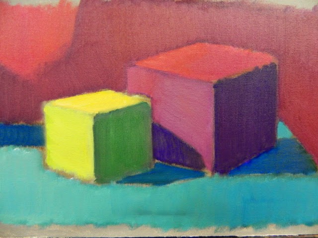
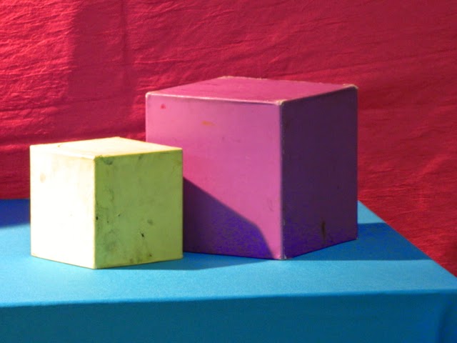
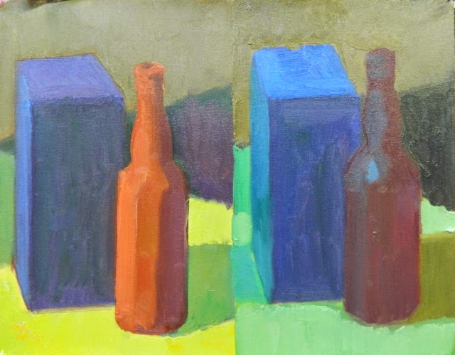
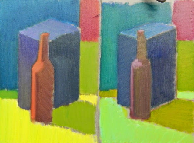
As we work on these color studies week after week, we get the hang of it. Fun to do because there is no concern, really, for the drawing of the boxes. It does not matter if the proportions are off. This is about seeing large color and value relationships and learning which colors to mix together to get an approximation of what we are seeing. Remember, when you are doing your color study you are not trying to match the color you see, but rather, recreate the illusion of the quality of light and color relationships.
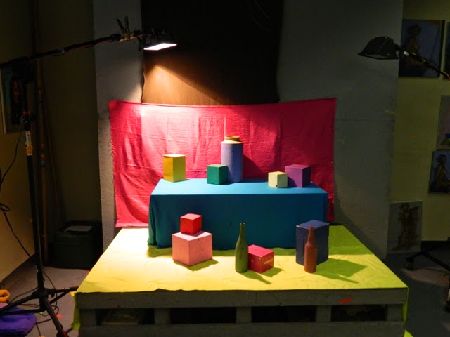
In order to set up your own color study still life, you will need many painted boxes of all sizes, pretty colored drapes, a good light source (we use halogen Home Depot lamps) and a dark room to work in. You could also set it up outside and do it in the sunlight, like Henri Hensche did. To start, however, perhaps artificial light will be easier because it will not change over the course of three or six hours.
It gets really exciting (to us, anyway) when the boxes in light and shadow start creating a sense of space and atmosphere, an illusion of depth, as it were, and yet all we were trying to do is see the color relationships accurately. What is behind? What is below? What is above? What is beside?
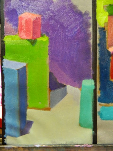
After three hours of working from these halogen light sources, our instructors, Natalie Italiano and Joe Dolderer, place colored gels over the lamps. This changes the color and the light drastically, as you can imagine. The following pictures have two studies on them, one in halogen light and the other in the effect of the bluish greenish gel.
It is important to start with the brightest color you see when you are making your first pass into your color study. It is much easier to dull a color already up there than make it, and all the surrounding colors, brighter. So start bold and brash and end up very lyrical and poetic. See how you can develop this very new art form.
In my name, Michela Mansuino

